Whether it’s on purpose or subconsciously, we all follow trends (yes, even you diehard hipsters out there). Trends aren’t very interesting just on their own, but the conversation around them is. How did the designer land on this decision? Why is this typeface so popular? Why is everyone using that type of illustration? Looking at trends can also mean challenging yourself to see if you can create something ‘off-trend,’ which might just be another trend in and of itself…Woah.
Let’s take a look at some trends we saw happening on the web in 2018, both good and bad.
*Something important to note before diving in: Take all of this with a grain of salt! The most important thing to consider with design is your user. You could be the trendiest trendsetter out there, but if you’re not doing some thorough research before even touching the design, then your project will most likely be a disaster. Research is the best trend!
Also, let’s count how many times I use the word trend/trendy.
Brutalism
A lot of designers are taking a Brutalist approach to their website’s aesthetic. This seems to be an extreme reaction to the clean, light design directions we have seen happening lately. Personally I find brutalism…pretty brutal (ha).
Some elements of brutalist web design include:
- Throwing elements on a screen. Do they work together? Probably not, but maybe!
- Getting rid of hierarchy—who needs it? (We all do.)
- Using high-contrast elements and colours.
- Using a grid? Nah.
- Adding flashy moving bits? Oh yeah.
- Is the website broken? Who knows!
In Brutalism, all of the elements are big, harsh, and fighting for your attention. Design studios and individual designers seem to be the ones embracing this trend the most, while in-house designers seem to be steering clear. Sometimes it works, sometimes it doesn’t. Brutalism isn’t for everybody, but 2018 was definitely all for it.
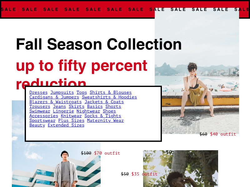
Muted colour palettes
First off, Pantone 2019 Colour of the Year: Living Coral. LOVE IT. Live it. A big ol’ trend right there.
There’s been a general shift in web design colour palettes from highly saturated, bright, vibrant colours to more gentle, toned down colours. Some things we’ve noticed in the world of colour on the web are:
- Pastels, light blues, pinks, greens, yellows, etc.
- BIG flat blocks of colour. Bye for now, gradient!
- Organic shapes paired with blocks of colour.
- Low contrast seems to be making an appearance.
- Avocado (because when aren’t avocados a good idea?)
- Mainly black and white with pops of colour.
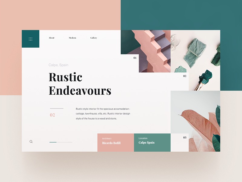
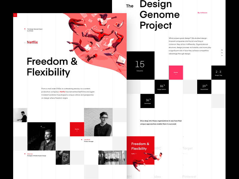
Quirky Type
Helvetica is no longer the go-to! There are definitely still some limitations with web-safe fonts and legibility, but we’re movin’ on up in the world of type on the web! Everyone has high-resolution screens now, which definitely allows for more freedom with fun, weird typefaces, and designers are 100% taking advantage of this.
Trendy type things we’ve noticed are:
- Pairing serifs or Slab serifs with super geometric sans-serifs.
- Using typefaces with a little more character and bounce to them.
- Choosing outlined type (vs filled type) is a thing.
- Picking high contrast serifs, such as Bodoni—high resolution screens allow for more of this!
- Monotype! We love this trend here at Kobot.
- BIG BOLD type
Shifty Business
Animation—or as I like to call it, shifty business—and movement on websites is very trendy right now…Almost too trendy? Who knows.
Animation has evolved A LOT in the past year, and designers are embracing this in both extreme and subtle ways. So, what kinds of shifty business have we seen on the web?:
- Parallax is still happening, although it has gotten more subtle. This is when you scroll through a website and the background images move by more slowly than foreground images, which creates more depth within your website.
- Stop animation seems to be popping up—love it!
- Images sliding into place.
- Subtle animations used to place emphasis on type.
- Movement with illustration to tell a story.
- Sticky elements, such as a constant callout on the side, or an interesting navigation.
- Transitional animations.
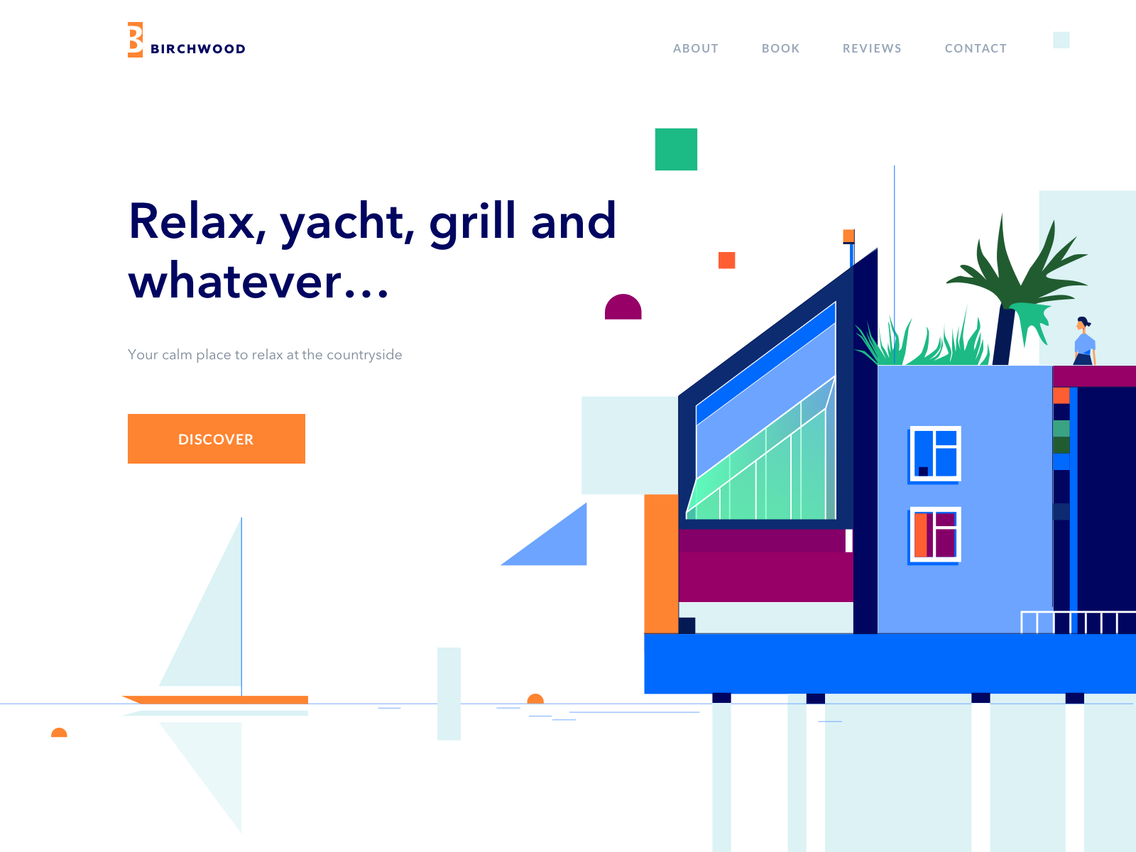
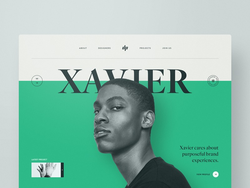
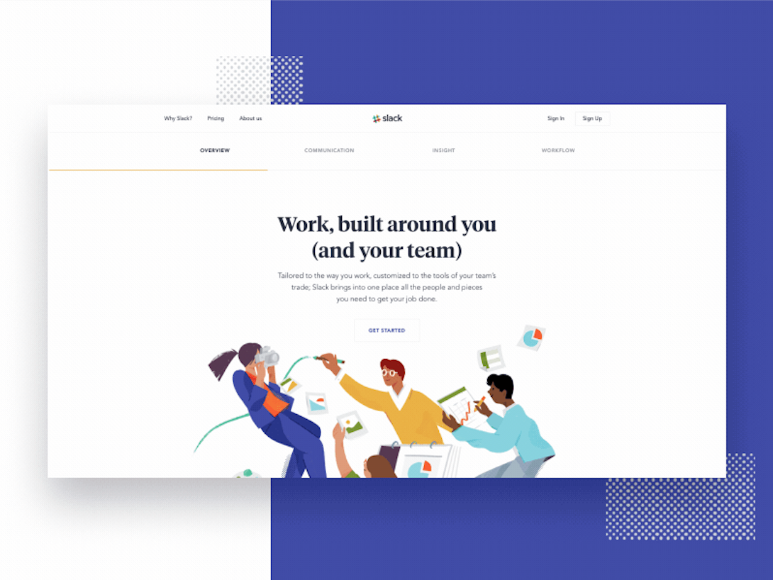
Lots of illustration!
At Kobot we try and bring illustration into our projects whenever we can! We noticed a lot of different types of illustration being used on websites in 2018. This could be to enhance a brand, tell a story, or just to add something unique and eye catching to the web design.
Some trendy illustration-y things we noticed:
- Organic and geometric illustrations, with lots of rounded edges.
- Bright colours and textures.
- Hand-drawn style (à la Mailchimp).
- Lots of people…lots and lots of people…
- Bringing humour into the illustrations.
Our faves
All that said, we definitely were not immune to some of the nifty trends from 2018. Some trendddddyyyy things Kobot loved from 2018 are:
- Brands being transparent and vulnerable.
- Palm leaves? Into it.
- Hamburgers are here to stay and we love them!
- Sliding side navigations.
- Reference back to a strict grid.
- Mobile-friendly sites.
Last but not least, I have to reiterate: trends may come and go, but user-focused design is forever. Looking forward to seeing what stays and what goes from 2018, and what new trends 2019 will bring us!
Official counter of how many times Mariah used the word “trend”: 26.
This blog post is based on a recent episode of Ask Kobot Anything, our weekly Instagram Live where we let you ask us, well…anything! Questions or comments about this post, or just want to see something discussed on the show? Email us! And catch Ask Kobot Anything every Friday at 11:30 MST on our Instagram.